Zombieland uses titles very effectively, in the title sequence and throughout the movie, by using the characters' movements to move the titles. For example, in the picture above, when the character is smashing a window, the title disintegrate with the window, almost as though they were physically there. Zombieland establishes clear branding with the titles all being in a red, sans serif font, and all in capitals.
(Title sequence)
Sin City also has very clear branding, using only red, black and white, which is consistent with the opening scene. The titles for each character are in a red, sans serif font, all in capitals, but more comic book-esque than the Zombieland ones. Each title of the actor's name is in front of a comic book style drawing of the character, symbolising the fact that the film is an adaptation of a graphic novel.
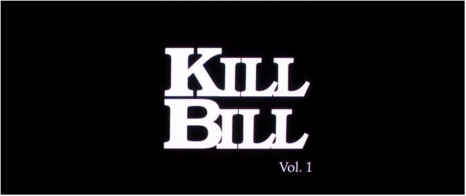
Kill Bill has comparatively simple titles, using only black and white, with a serif font for the first 3 titles, including the title card of the film name, mostly in capitals. The titles fade in and out, and after the title card of the film, the names are capitalised normally. Then a picture of a woman's silhouette fades in as the titles fade in and out. The black and white titles tie in with the opening scene, which is entirely black and white.
The conventions of branding that are used in these titles sequence we hope to apply to our titles, and we intend on using titles as effectively as we can.


No comments:
Post a Comment